Ecommerce stores and brick and mortar sites represent different retail models, but they have this in common: if they don’t look good, people won’t want to go there. Your eCommerce site can have amazing products at great prices, but if the pages are not visually pleasing, visitors will leave and shop somewhere else.
Gone are the days when you can throw up a page with nothing but products and prices and expect people to beat an electronic path to your door. You need to use up-to-date features and effects to catch the prospective customer’s eye and encourage them to stick around and buy something.
Your site also has to be attractive on mobile devices. A lot of your prospects do their shopping by phone and never use anything larger than a tablet.
Here are eight visual elements that you should include if you expect to attract customers and keep them at your site long enough to spend money.
1. Hero Slider
The hero image is an oversize image that appears near the top of the page or sometimes even fills the entire page. A hero slider is a sequence of hero images.
Often the hero slider is dynamic; for example, the image will change, or multiple smaller images will popup over a large image. These sliders can use animation, can be scrollable, and might transition between landscape and vertical images.
Hero sliders interest visitors and reduce the probability that they’ll move on from your site. They’re often what differentiates a modern, professional-looking site from a boring and dated one. They can express your brand image and draw people into what you have to offer. If you’re using WordPress, you can easily create a slider with the help of a dedicated plugin. Otherwise, there are standalone tools out there to help you create your website slider.
2. Logo
If you don’t have a logo for your business, you should strongly consider building one. A logo not only appears on your website; it puts forward your brand everywhere a customer or prospective customer might encounter you. It can be on your business cards, on any signage you might have, and on non-electronic advertising. You can use it in your emails and your social media posts. Over time it will become recognized and trusted as representing you and your products.
To create your own unique logo and solidify your brand identity, you can engage a designer, or you can use an online tool. With many of them, you supply some business details and specify your preferred styles, colors, and fonts, and the software will provide samples you can adopt or customize.
3. Color Palette
The colors on your website establish your visual identity. Your color palette is one of the first things a visitor notices.
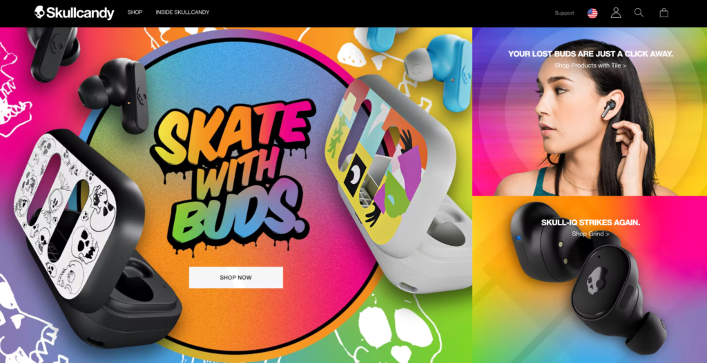
Consider the colors on the Skullcandy website. The word “candy” is in the company’s name, and the explosion of pastels is reminiscent of candy. The color scheme match not only the colors of some of their products but also the youthful, exuberant image that the site projects.

There are some principles for selecting a color palette. It pays to understand the color wheel and how to use opposite colors as well as closely related ones. You also should be familiar with the psychology of color. For example, red symbolizes excitement and strength, blue is a peaceful and relaxing color and green is associated with nature and healing. Strive for emotions that will resonate with those who use your product.
4. Product Images
So many sites do a poor job of this, showing a single static image without much detail for each product. There’s an opportunity for you to stand out with exciting, appealing product images on your site.
Think of what people do in a brick-and-mortar store. They take the product off the shelf, turn the box about and look at it from every angle. They read the text on the front and sides. Online, you should at the very least give people what they get at a physical retail location.
Offer people multiple images from every reasonable angle. Make the accompanying text more than just something you read off a box. You can embed links and highlight wording with different fonts and colors. You might suggest similar or accompanying products. You could use backgrounds that show the product off advantageously.
5. Lifestyle Images
People don’t buy a product just to set it on a shelf and admire it. They use it. They use it with their friends and family. They might have fun while they’re making use of it.
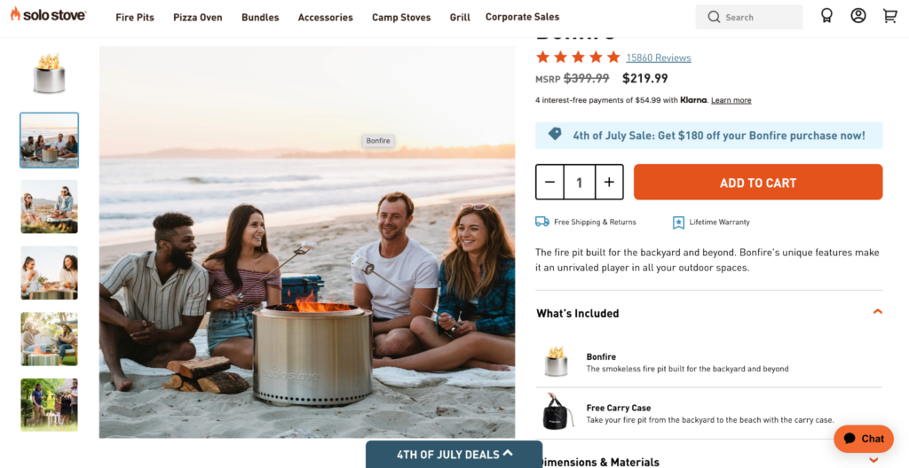
Consider the images on this page for the Solo Stove Bonfire. They run down the left-hand side of the screen. Note that most involve people, and they show folks having a good time using their product. They don’t just show one person; there are family and friends who are happy to be together using the company’s product.

Solo Stove understands that they’re not selling a piece of metal that shoots up flames. They’re selling good times. In their images, people are roasting marshmallows or simply enjoying each other’s company while the stove carries on in the background, adding to the atmosphere.
Your products do something to make people’s lives better. Use images to show that.
6. Product Videos
Static images have their place, but the internet is a medium that allows for so much more. TV ads don’t show a product just sitting there. Why should a website? TV doesn’t picture cars are rest on the street and cans of beverages that no one opens and drinks. Video content was found to be effective to promote sales on eCommerce sites, as well as creating more engagement in the page it is included.
Anyone can take a video with a phone and upload it, but if you’re looking for a more professional feel to your product video, you can use a product video maker, and then customize your video and add music that reflects your brand. It is also recommended to post your product videos on social media in addition to your website.
7. Popup
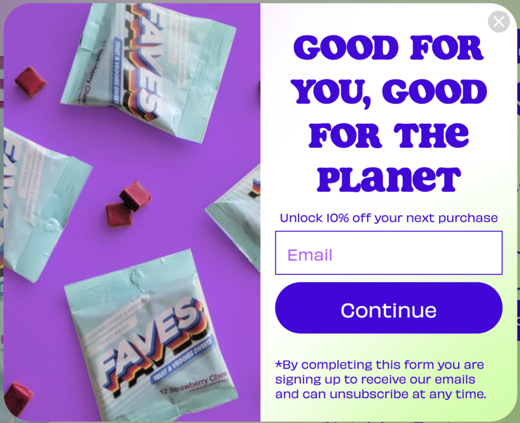
What do you want visitors to do when they get to your site? You could place a button at the bottom of the page inviting them to Learn More or take some other action. On the other hand, look at what this Climate Candy popup does.

When you’ve had a few moments to see what sort of product the site offers, it pops up a screen that calls you to action. It asks you to sign up for their emails and offers an incentive for doing so in the way of a discount.
Even if the customer doesn’t make a purchase right away, they’ll be reminded about what they can get from this website at multiple points in the future.
8. Trust Seals
If people aren’t convinced that your website is secure, they won’t enter their credit card info and buy from you. When you purchase a TLS certificate (also known by its previous name, SSL), your site gets a padlock icon and an https:// prefix on its address. This tells customers that traffic with you is encrypted and that their card information is protected.
Depending on the TLS vendor, you may also get a trust seal, which is an image that validates the level of confidence a visitor can have in your site. There are different levels of TLS validation. The most basic simply ensures encryption, but an Extended Validation guarantees that you’re really the company your address bar says you are.
It’s pretty easy to set up an eCommerce website these days. Some would argue it’s a little too easy. There are a lot of sites that are unprofessional and sloppily put together. If you use these eight visuals, however, it will set your eCommerce site apart as one that looks professional and can be trusted. Customers will feel comfortable doing business with you.


![Read more about the article [Easy 5 Steps] How To Develop Content Marketing Strategies?](https://wuschools.com/wp-content/uploads/2022/09/Content-Marketing-Strategies-300x169.jpg)
