The logo is part of the tangible elements of a brand, which together with a color scheme, typography, and other graphic elements such as photography, videos, textures, etc. They form a coherent set that will be the visual expression of the brand and help create a footprint on the customer. A beautiful visual image differentiates itself from the competition and represents those values that any business wants to convey. Thus, to design a logo, you must meet these five characteristics: A good logo should be simple, memorable, timeless, versatile, and appropriate.
Before I tell you what a good logo has to have that is also functional, we will tell you a little about the differences between some concepts that are sometimes used inappropriately when referring to the way to represent a brand:
- Logo and logotype: The word logo comes from the name logo (logo = word), but it is normally used to refer to the entire set of graphic elements that make up our brand (logo, isotype, imagotype, isologo). The logo is purely typographic like Google, Coca-cola, etc.
- Isotype: It is the symbolic or iconic part of the logo. We recognize the brand without the need to see any text, for example, the symbol for Nike, the “M” for Macdonald’s, and so on.
- Imagotype: It is a differentiated text and symbol that can function separately. Examples are Puma, Pepsi, etc.
- Isologo: Both the text and the icon are a single element, they are inseparable and they only work together. Examples are Burger King, Starbucks, etc.
You can use the logo maker app to create your logo. These apps give you ready-made templates you can simply edit it and use. Although there are no magic recipes to design a good logo, and each case and each client is a world, we must try to ensure that a brand’s logo has all or some of these five characteristics, which are the ones that meet the best logos.
Five essential characteristics for a logo
1. Simple
A logo is a graphic element that identifies a brand. It does not have to be a detailed drawing of everything done in a business or represent everything a brand means. In a logo, less is more.

The designer of this dynamic symbol known as “Swoosh” was based on the Greek goddess “Nike” wing. A simple symbol is a good example for brands.
2. Memorable
A good logo must be easily remembered. That is why we have started from simplicity as the “number one” characteristic of a good logo. Please bear in mind that it must be appropriate for the brand’s target audience and have that touch of originality. Nowadays, it is tough to create something unique, but each case must be different and unique.

Just by seeing the puma, do we know what brand we are talking about or not? The company chose Puma to represent its values: agility, sagacity, and strength. The logo evolved in 1979 towards a simpler version but kept the original idea with a more solid and thick typeface that conveys stability. It is a good example of a simple and memorable logo.
3. Timeless
Many times the simplest logos are the ones that last the longest. Sometimes what we like the most now, in a few years it will no longer be worn or we will no longer like it. So we feel the need to redesign the logo of our brand. For this reason, you have to be guided by a good graphic designer and reach that balance between what the client likes, what they are wearing at that moment and what should be done so that a brand leaves its mark and lasts over time.
Although timeless, it does not mean that Big brands cannot change over time. Big brands can change from time to time, adapting to their environment without losing their identity.

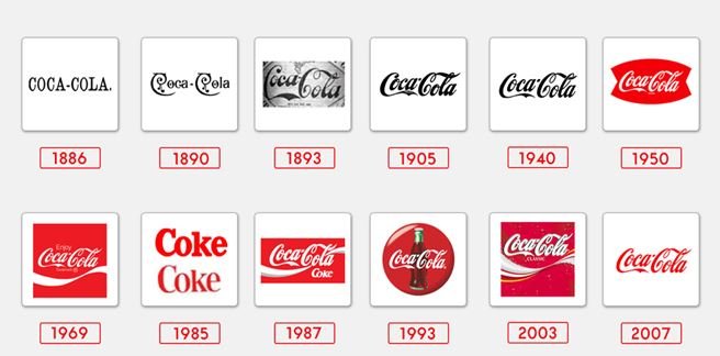
More than 130 years of change! Since 1886, the logo of one of the best-known brands in the world has evolved, but WITHOUT losing its essence.
4. Versatile
A good logo should be designed in vector format to be scaled to any size. You have to think that it should be effective and readable in many types of media and applications: large-scale printing, in tiny sizes, on the web, video, etc.
It should also work well in black and white, negative (on a dark background) and positive.
It is often better to show a design for the first time to the client without colors, in black and white, so as not to distort the concept since the color is emotional.

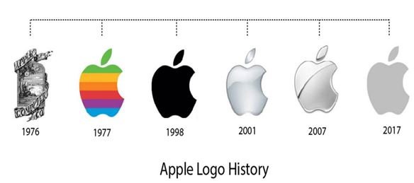
The Apple logo is inspired by the apple that Isaac Newton used to study gravity. The bite of the apple is there for a matter of scale so that when the logo is small, it would not be confused with a cherry.
5. Appropriate
A logo must be appropriate for your target audience. It does not have to communicate everything but must be a representation of the essence of a brand. It must be identified. A dentist’s logo does not have to be a tooth or a tooth or a technology company logo, a computer. A logo acquires meaning when it connects with the brand’s public. You have to use fonts and color schemes that connect with that audience.

Amazon has managed to create very strong brand recognition. Between the “A” and the “Z,” an arrow symbolizes that they sell everything. With the arrow, a smile is sensed. A simple design that connects with the brand’s audience, the consumer, can buy everything and the experience will be pleased with the touch of that smile.
To sum up
The logo is part of your brand, but a brand is much more than a logo. Your brand is a concept, which is represented with visual elements and others that are not. The visual elements constitute the brand identity, and within them, the most significant is the logo. Each case is particular, and many factors must be taken into account when designing a brand logo. We must try to achieve these characteristics in a logo based on the fact that the graphic designer has to be clear about the values they want to convey, the target audience, and the message they want to convey to achieve the best result.


