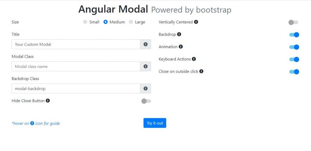
ngbmodal is the widgets of bootstrap that is used in angular like autocomplete, accordion, alert, carousel, dropdown, pagination, popover, progressbar, rating, tabset, timepicker, tooltip ect.
Installation
npm install --save ngb-modalFor Angular[2,4,5] and bootstrap 3, install older version
npm install --save ngb-modal@0.0.4For Angular 6 and bootstrap 3, install older version
npm install --save ngb-modal@1.0.5ngbmodal Example
You can see the live ngbmodal example here: View Example

Usage of ngbmodal
Import ModalModule into your module
your-module.module.ts
import { ModalModule } from 'ngb-modal';

@NgModule({
  imports: [
    ...
    ModalModule,
  ],
Now Start using the modal component in your components.
your-component.component.html
<modal #myModal>
    <modal-header>
        Modal header content goes there.
    </modal-header>

    <modal-content>
        Modal body content goes there.
    </modal-content>

    <modal-footer>
        Modal footer content goes there.
    </modal-footer>
</modal>
Properties
* title?: String;
* size?: String | "md";
* modalClass?: String | '';
* hideCloseButton?: Boolean | false;
* centered?: Boolean | false;
* backdrop?: Boolean | 'static' | true;
* animation?: Boolean | true;
* keyboard?: Boolean | true;
* closeOnOutsideClick?: Boolean | true;
* backdropClass?: String | "modal-backdrop";
Opening a Modal
your-component.ts
import { ModalManager } from 'ngb-modal';

@Component({
selector: "app",
template: `
    <div class="row">
        <button (click)="openModal()">open my modal</button>
        <modal #myModal (onOpen)="" (onClose)="">
            <modal-header>
                <h1>Modal header</h1>
            </modal-header>
            <modal-content>
                Hello Modal!
            </modal-content>
            <modal-footer>
                <button class="btn btn-primary" (click)="closeModal()">close</button>
            </modal-footer>
        </modal>
    </div>`
})
export class YourComponent {
    @ViewChild('myModal') myModal;
    private modalRef;
    constructor(private modalService: ModalManager){}

    openModal(){
        this.modalRef = this.modalService.open(this.myModal, {
            size: "md",
            modalClass: 'mymodal',
            hideCloseButton: false,
            centered: false,
            backdrop: true,
            animation: true,
            keyboard: false,
            closeOnOutsideClick: true,
            backdropClass: "modal-backdrop"
        })
    }
    closeModal(){
        this.modalService.close(this.modalRef);
        //or this.modalRef.close();
    }
}
The separate component as modal:
You can make a separate component for the modal window. In this case, remember to add your component as an entryComponents section of your NgModule. Also set ViewContainerRef in your root component as below.
@NgModule({
  declarations: [
    AppComponent, ModalComp
  ],
  imports: [
    ...
    ModalModule,
  ],
  providers: [],
  bootstrap: [AppComponent],
  entryComponents: [ModalComp]
})
export class AppModule { }

export class AppComponent {
    constructor(private modalService: ModalManager, private vcr: ViewContainerRef) {
        this.modalService.setDefaults({
        title: "new modal",
        size: "sm",
        modalClass: 'mymodal',
        hideCloseButton: true,
        centered: false,
        backdrop: true,
        animation: true,
        keyboard: true,
        closeOnOutsideClick: true,
        backdropClass: "modal-backdrop"
        })
        this.modal.setRootViewContainerRef(this.vcr);
    }
}

import { ModalComponent } from 'ngb-modal';

@Component({
  selector: 'app-modal',
  template: `<modal>
  <modal-header>
      Modal as a component
  </modal-header>

  <modal-content>
      <span>{{data}}</span>
      Modal body content goes there.
  </modal-content>

  <modal-footer>
      Modal footer content goes there.
  </modal-footer>
</modal>`
})
export class ModalComp{
    @ViewChild(ModalComponent) ModalComponent;
    @Input() data;
}

export class YourComponent {
    private modalRef;
    constructor(private modalService: ModalManager){}

    openModal(){
        this.modalRef = this.modalService.open(ModalComp, {
            size: "md",
            modalClass: 'mymodal',
            hideCloseButton: false,
            centered: false,
            backdrop: true,
            animation: true,
            keyboard: false,
            closeOnOutsideClick: true,
            backdropClass: "modal-backdrop"
        });
        this.modalRef['data'] = "any data you want to pass to ModalComp class";
        this.modalRef.onOpen.subscribe(() => {
            console.log("comp opened");
        })
        this.modalRef.onClose.subscribe(() => {
            console.log("comp closed");
        })
    }
    closeModal(){
        this.modalService.close(this.modalRef);
        //or this.modalRef.close();
    }
}
API
ModalManager expose 4 methods to the component to control the modal.
* open: Method // used open a particular modal. 1st argument is modalRefence you want to open,2nd is config you want to be applied on this modal.It returns instance of opened modal, which has 3 properties:
    * onOpen : Observable // fired once this modal is opened
    * onClose : Observable // fired once this modal is closed
    * close : Method // can be used to close this modal

* close : Method //Used to close any opened modal by passing the reference of that modal.
* setDefaults : Method //to be called from root component to provide global configurations for all modals.
* setRootViewContainerRef: Method //called if using separate component as modal. called from root component to set container for all modals at root level.
Output
These 2 output events are published on <modal></modal> component.
onOpen : Fired after modal is opened. onClose : Fired after modal is closed
Reference
https://ng-bootstrap.github.io/#/components/modal/examples
Visit the angular tutorial list. And make strong your angular concept. click here. wuschools.com is always written about the Agular concept for the angular lover. Ang writes about how angular makes your life easy if you are a web site developer.


