BrowserAnimationsModule is used to add the animation in your angular application. As with most Angular features, the best place to start is with an example. Which will let me introduce how animation works. And how it fits into the rest of the Angular functionality. In the sections that follow, I create a basic animation that will affect the rows in the table of products. Once you have seen how the basic features work. I will dive into the detail for each of the different configuration options. And explain how they work in depth.
But to get started, I am going to add a select element to the application that allows the user to select a category. When a category is selected, the table rows for products in that category will be shown in one of two styles. As described in the following table.
The Styles for the Animation Example
| Description | Styles |
| The product is in the selected category. | The table row will have a green background and larger text. |
| The product is not in the selected category. | The table row will have a red background and smaller text |
BrowserAnimationsModule Import
The animation features are contained. In their own module that must be imported in the application’s root module. As shown in the following.
Importing the Animation Module in the app.module.ts File in the src/app Folder
import { NgModule } from "@angular/core";
import { BrowserModule } from "@angular/platform-browser";
import { ModelModule } from "./model/model.module";
import { CoreModule } from "./core/core.module";
import { TableComponent } from "./core/table.component";
import { FormComponent } from "./core/form.component";
import { MessageModule } from "./messages/message.module";
import { MessageComponent } from "./messages/message.component";
import { routing } from "./app.routing";
import { AppComponent } from "./app.component";
import { TermsGuard } from "./terms.guard"
import { LoadGuard } from "./load.guard";
import { BrowserAnimationsModule } from "@angular/platform-browser/animations";
@NgModule({
 imports: [BrowserModule, CoreModule, MessageModule, routing,
 BrowserAnimationsModule],
 declarations: [AppComponent],
 providers: [TermsGuard, LoadGuard],
 bootstrap: [AppComponent]
})
export class AppModule { }
Creating the Animation (BrowserAnimationsModule)
To get started with the animation(browseranimationsmodule), I created a file called table.animations.ts in the src/app/core folder and added the code shown in the following example.
The Contents of the table.animations.ts File in the src/app/core Folder
import { trigger, style, state, transition, animate } from "@angular/animations";
export const HighlightTrigger = trigger("rowHighlight", [
 state("selected", style({
 backgroundColor: "lightgreen",
 fontSize: "20px"
 })),
 state("notselected", style({
 backgroundColor: "lightsalmon",
 fontSize: "12px"
 })),
 transition("selected => notselected", animate("200ms")),
 transition("notselected => selected", animate("400ms"))
]);
The syntax used to define animations(browseranimationsmodule) can be dense and relies on a set of functions defined in the @ angular/animations module. In the following sections, I start at the top and work my way down through the detail to explain each of the animation building blocks used in the listing.
Tip: Don’t worry if all the building blocks described in the following sections don’t make immediate sense. This is an area of functionality that starts to make more sense only when you see how all the parts fit together.
Defining Style Groups
The heart of the animation system is the style group, which is a set of CSS style properties and values that will be applied to an HTML element. Style groups are defined using the style function, which accepts a JavaScript object literal that provides a map between property names and values, like this:
...
style({
 backgroundColor: "lightgreen",
 fontSize: "20px"
})
...
This style group tells Angular to set the background color to light green and to set the font size to 20 pixels.
CSS PROPERTY NAME CONVENTIONS
There are two ways to specify CSS properties when using the style function. You can use the JavaScript property naming convention, such that the property to set the background color of an element is specified as backgroundColor (all one word, no hyphens, and subsequent words capitalized). This is the convention I used in the above example.
...
style({
 backgroundColor: "lightgreen",
 fontSize: "20px"
})),
...
Alternatively, you can use the CSS convention, where the same property is expressed as backgroundcolor (all lowercase with hyphens between words). If you use the CSS format, then you must enclose the property names in quotes to stop JavaScript from trying to interpret the hyphens as arithmetic operators, like this
...
state("green", style({
 "background-color": "lightgreen",
 "font-size": "20px"
})),
...
It doesn’t matter which name convention you use, just as long as you are consistent. At the time of writing, Angular does not correctly apply styles if you mix and match property name conventions. To get consistent results, pick a naming convention and use it for all the style properties you set throughout your application.
Defining the Element States
Angular needs to know when it needs to apply a set of styles to an element. This is done by defining an element state, which provides a name by which the set of styles can be referred to. Element states are created using the state function, which accepts the name and the style set that should be associated with it. This is one of the two-element states that are defined in the above example.
...
state("selected", style({
 backgroundColor: "lightgreen",
 fontSize: "20px"
})),
...
There are two states in the listing, called selected and not selected, which will correspond to whether the product described by a table row is in the category selected by the user.
Defining State Transitions
When an HTML element is in one of the states created using the state function, Angular will apply the CSS properties in the state’s style group. The transition function is used to tell Angular how the new CSS properties should be applied. There are two transitions in the following example.
...
transition("selected => notselected", animate("200ms")),
transition("notselected => selected", animate("400ms"))
...
The first argument passed to the transition function tells Angular which states this instruction applies to. The argument is a string that specifies two states and an arrow that expresses the relationship between them. Two kinds of arrow are available, as described in the following Table.
The Animation Transition Arrow Types
| Arrow | Example | Description |
| => | selected => notselected | This arrow specifies a one-way transition between two states, such as when the element moves from the selected state to the notselected state. |
| <=> | selected <=> notselected | This array specifies a two-way transition between two states, such as when the element moves from the selected state to the notselected state and from the notselected state to the selected state. |
The transitions defined in the above example use one-way arrows to tell Angular how it should respond when an element moves from the selected state to the notselected state and from the notselected state to the selected state.
The second argument to the transition function tells Angular what action it should take when the state change occurs. The animate function tells Angular to gradually transition between the properties defined in the CSS style set defined by two-element states. The arguments passed to the animate function in the above example specify the period of time that this gradual transition should take, either 200 milliseconds or 400 milliseconds.
GUIDANCE FOR APPLYING ANIMATIONS
Developers often get carried away when applying animations, and the result is applications that users find frustrating. Animations should be applied sparingly, they should be simple, and they should be quick. Use animations to help the user make sense of your application and not as a vehicle to demonstrate your artistic skills. Users, especially for corporate line-of-business applications, have to perform the same task repeatedly, and excessive and long animations just get in the way.
I suffer from this tendency, and, unchecked, my applications behave like Las Vegas slot machines. I have two rules that I follow to keep the problem under control. The first is that I perform the major tasks or workflows in the application 20 times in a row. In the case of the example application, that might mean creating 20 products and then editing 20 products. I remove or shorten any animation that I find myself having to wait to complete before I can move on to the next step in the process.
The second rule is that I don’t disable animations during development. It can be tempting to comment out an animation when I am working on a feature because I will be performing a series of quick tests as I write the code. But any animation that gets in my way will also get in the user’s way, so I leave the animations in place and adjust them—generally reducing their duration—until they become less obtrusive and annoying.
You don’t have to follow my rules, of course, but it is important to make sure that the animations are helpful to the user and not a barrier to working quickly or a distracting annoyance.
Defining the Trigger
The final piece of plumbing is the animation trigger, which packages up the element states and transitions and assigns a name that can be used to apply the animation in a component. Triggers are created using the trigger function, like this:
...
export const HighlightTrigger = trigger("rowHighlight", [...])
...
The first argument is the name by which the trigger will be known, which is rowHighlight in this example, and the second argument is the array of states and transitions that will be available when the trigger is applied.
Applying the Animation (browseranimationsmodule)
Once you have defined an animation, you can apply it to one or more components by using the animations property of the @Component decorator. The following example applies the animation defined in the above example to the table component and adds some additional features that are needed to support the animation.
Applying an Animation in the table.component.ts File in the src/app/core Folder
import { Component, Inject } from "@angular/core";
import { Product } from "../model/product.model";
import { Model } from "../model/repository.model";
import { ActivatedRoute } from "@angular/router";
import { HighlightTrigger } from "./table.animations";
@Component({
 selector: "paTable",
 templateUrl: "table.component.html",
 animations: [HighlightTrigger]
})
export class TableComponent {
 category: string = null;
 constructor(private model: Model, activeRoute: ActivatedRoute) {
 activeRoute.params.subscribe(params => {
 this.category = params["category"] || null;
 })
 }
getProduct(key: number): Product {
 return this.model.getProduct(key);
 }
 getProducts(): Product[] {
 return this.model.getProducts()
 .filter(p => this.category == null || p.category == this.category);
 }
 get categories(): string[] {
 return this.model.getProducts()
 .map(p => p.category)
 .filter((category, index, array) => array.indexOf(category) == index);
 }
 deleteProduct(key: number) {
 this.model.deleteProduct(key);
 }
 highlightCategory: string = "";
 getRowState(category: string): string {
 return this.highlightCategory == "" ? "" :
 this.highlightCategory == category ? "selected" : "notselected";
 }
}
The animation(browseranimationsmodule) property is set to an array of triggers. You can define animations inline, but they can quickly become complex and make the entire component hard to read, which is why I used a separate file and exported a constant value from it, which I then assign to the animations property.
The other changes are to provide a mapping between the category selected by the user and the animation state that will be assigned to elements. The value of the highlightCategory property will be set using a select element and is used in the getRowState method to tell Angular which of the animation states defined in Listing 28-7 should be assigned based on a product category. If a product is in the selected category, then the method returns selected; otherwise, it returns notselected. If the user has not selected a category, then the empty string is returned.
The final step is to apply the animation to the component’s template, telling Angular which elements are going to be animated, as shown in the following example. This listing also adds a select element that sets the value of the component’s highlightCategory property using the ngModel binding.
Applying an Animation in the table.component.html File in the src/app/core Folder
<div class="form-group bg-info text-white p-2">
 <label>Category</label>
 <select [(ngModel)]="highlightCategory" class="form-control">
 <option value="">None</option>
 <option *ngFor="let category of categories">
 {{category}}
 </option>
 </select>
</div>
<table class="table table-sm table-bordered table-striped">
 <tr>
 <th>ID</th><th>Name</th><th>Category</th><th>Price</th><th></th>
 </tr>
 <tr *ngFor="let item of getProducts()"
 [@rowHighlight]="getRowState(item.category)">
 <td style="vertical-align:middle">{{item.id}}</td>
 <td style="vertical-align:middle">{{item.name}}</td>
 <td style="vertical-align:middle">{{item.category}}</td>
 <td style="vertical-align:middle">
 {{item.price | currency:"USD" }}
 </td>
 <td class="text-center">
 <button class="btn btn-danger btn-sm"
 (click)="deleteProduct(item.id)">
 Delete
 </button>
 <button class="btn btn-warning btn-sm"
 [routerLink]="['/form', 'edit', item.id]">
 Edit
 </button>
 </td>
 </tr>
</table>
<div class="m-2">
 <button class="btn btn-primary" routerLink="/form/create">
 Create New Product
 </button>
</div>
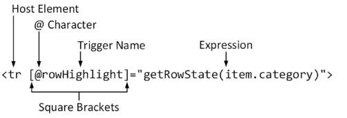
Animations are applied to templates using special data bindings, which associate an animation trigger with an HTML element. The binding’s target tells Angular which animation trigger to apply, and the binding’s expression tells Angular how to work out which state an element should be assigned to, like this:
...
<tr *ngFor="let item of getProducts()" [@rowHighlight]="getRowState(item.category)">
...
The target of the binding is the name of the animation trigger, prefixed with the @ character, which denotes an animation binding. This binding tells Angular that it should apply the rowHighlight trigger to the tr element. The expression tells Angular that it should invoke the component’s getRowState method to work out which state the element should be assigned to, using the item. category value as an argument. The following image illustrates the anatomy of an animation(browseranimationsmodule) data binding for quick reference.

Testing the Animation Effect
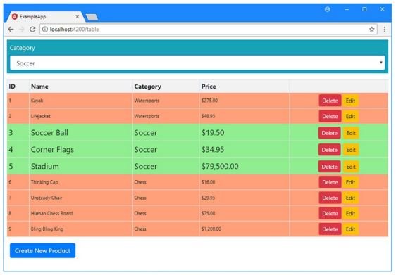
The changes in the previous section add a select element above the product table. To see the effect of the animation, select Soccer from the list, and Angular will use the trigger to figure out which of the animation(browseranimationsmodule) states each element should be applied to. Table rows for products in the Soccer category will be assigned to the selected state, while the other rows will be assigned to the notselected state, creating the effect shown in the following image.

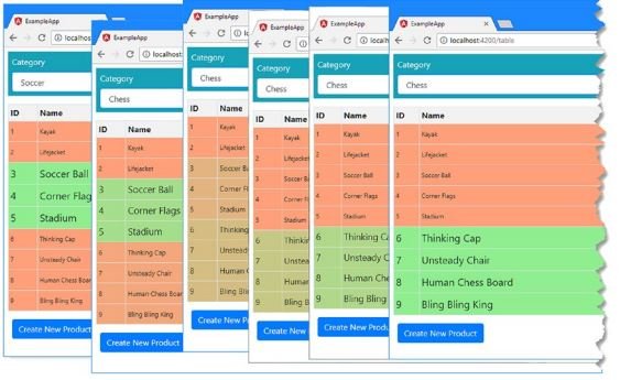
The new styles are applied suddenly. To see a smoother transition, select the Chess category from the list, and you will see a gradual animation (browseranimationsmodule) as the Chess rows are assigned to the selected state and the other rows are assigned to the notselected state. This happens because the animation trigger contains transitions between these states that tell Angular to animate the change in CSS styles, as illustrated in following image. There is no transition for the earlier change, so Angular defaults to applying the new styles immediately.
Tip It is impossible to capture the effect of animations in a series of screenshots, and the best I can do is present some of the intermediate states. This is a feature that requires firsthand experimentation to understand. I encourage you to download the project for this post from GitHub and create your own browseranimationsmodule project.

To understand the browseranimationsmodule system, you need to understand the relationship between the different building blocks used to define and apply an animation, which can be described like this:
- Evaluating the data binding expression tells Angular which animation state the host element is assigned to.
- The data binding target tells Angular which animation target defines CSS styles for the element’s state.
- The state tells Angular which CSS styles should be applied to the element.
- The transition tells Angular how it should apply CSS styles when evaluating the data binding expression results in a change to the element’s state.
Keep these four points in mind as you read through the rest of the chapter, and you will find the animation system easier to understand.
Reference
https://angular.io/api/platform-browser/animations/BrowserAnimationsModule
Visit the angular tutorial list. And make strong your angular concept. click here. wuschools.com is always written about Agular concept for the angular lover. Ang writes about how angular makes your life easy if you are a web site developer.


A useful post. I want to talk with the author. Please contact me by email divingcyprus[at]gmail.com.
Like!! I blog quite often and I genuinely thank you for your information. The article has truly peaked my interest.
Hello There. I found your blog the use of msn. This is an extremely neatly written article. I will make sure to bookmark it and come back to read more of your useful info. Thanks for the post. I will certainly comeback.|
Hi there, just wanted to say, I liked this article. It was practical. Keep on posting!|
Woah! I’m really loving the template/theme of this website. It’s simple, yet effective. A lot of times it’s difficult to get that “perfect balance” between user friendliness and visual appeal. I must say you have done a excellent job with this. In addition, the blog loads very quick for me on Internet explorer. Excellent Blog!|
Hurrah! Finally I got a web site from where I be capable of really take helpful data concerning my study and knowledge.|
I know this website provides quality depending posts and extra stuff, is there any other web site which provides such information in quality?|