
ngx bootstrap all components like datepicker, dropdown, pagination, etc are powered by angular. ngx bootstrap is an open-sourced project under the MIT license. The most widely used framework is Bootstrap, which consists of a set of CSS classes that can be applied to elements to style them consistently and the JavaScript code that performs additional enhancement. For adding the components in the angular application angular provide the ngx bootstrap, it’s totally powered by angular and it contains all core components so no need to add original javascript components because all components are provided in the ngx bootstrap.
Installation
Install ngx-bootstrap from npm
npm install ngx-bootstrap --saveYou will need bootstrap style and link bootstrap 3
<!-- index.html -->
<link href="https://maxcdn.bootstrapcdn.com/bootstrap/3.3.7/css/bootstrap.min.css" rel="stylesheet">
Or link bootstrap 4
<!--- index.html -->
<link href="https://maxcdn.bootstrapcdn.com/bootstrap/4.0.0/css/bootstrap.min.css" rel="stylesheet">
Getting started with angular-CLI
Note: you can skip this part if you already have application generated by
ng-cliand webpack
npm i -g @angular/cli
ng new my-app
cd my-app
ng serve
Install ngx bootstrap and bootstrap
npm install ngx-bootstrap bootstrap --saveOpen src/app/app.module.ts and add:
import { AlertModule } from 'ngx-bootstrap';
...

@NgModule({
   ...
   imports: [AlertModule.forRoot(), ... ],
   ...
})
Open angular.json and insert a new entry into the styles array:
"styles": [
         "./node_modules/bootstrap/dist/css/bootstrap.min.css",
        "styles.css",
      ],
Open src/app/app.component.html and add:
<alert type="success">hello</alert>Compatibility of ngx bootstrap
Here is the version compatibility list with only two dependencies Angular and Bootstrap.
| NGX-Bootstrap | Angular | Bootstrap CSS |
| 5.x.x | 7.x.x – 8.x.x | 3.x.x or 4.x.x |
| 4.x.x | 6.x.x – 7.x.x | 3.x.x or 4.x.x |
| 3.x.x | 6.x.x – 7.x.x | 3.x.x or 4.x.x |
| 2.x.x | 2.x.x – 4.x.x | 3.x.x or 4.x.x |
| 1.x.x | 2.x.x | 3.x.x or 4.x.x |
Components of NGX Bootstrap
In the following i’m going to describe some components of ngx bootstrap with code examples and installaction.
ngx bootstrap Accordion
The accordion component is used to displays collapsible content panels for presenting information in a limited amount of space.
The easiest way to add an accordion component to your app (will be added to the root module)
ng add ngx-bootstrap --component accordionUsage
import { BrowserAnimationsModule } from '@angular/platform-browser/animations';

// RECOMMENDED
import { AccordionModule } from 'ngx-bootstrap/accordion';
// or
import { AccordionModule } from 'ngx-bootstrap';

@NgModule({
  imports: [
    BrowserAnimationsModule,
    AccordionModule.forRoot(),
    ...
  ]
})
export class AppModule(){}

Also should be added web-animations-js polyfill for IE browser (Edge)
Template
<accordion>
  <accordion-group heading="Static Header">
    This content is straight in the template.
  </accordion-group>
  <accordion-group heading="Another group">
    <p>Some content</p>
  </accordion-group>
  <accordion-group heading="Another group">
    <p>Some content</p>
  </accordion-group>
  <accordion-group heading="Another group">
    <p>Some content</p>
  </accordion-group>
</accordion>
Component
import { Component } from '@angular/core';

@Component({
  selector: 'demo-accordion-basic',
  templateUrl: './basic.html'
})
export class DemoAccordionBasicComponent {}
ngx bootstrap Alerts
Alerts component is used to display the alter message for the user or use to display the feedback for the users.
The easiest way to add an alerts component to your app.
ng add ngx-bootstrap --component alertsUsage
// RECOMMENDED
import { AlertModule } from 'ngx-bootstrap/alert';
// or
import { AlertModule } from 'ngx-bootstrap';

@NgModule({
  imports: [AlertModule.forRoot(),...]
})
export class AppModule(){}
<alert type="success">
  <strong>Well done!</strong> You successfully read this important alert message.
</alert>
<alert type="info">
  <strong>Heads up!</strong> This alert needs your attention, but it's not super important.
</alert>
<alert type="warning">
  <strong>Warning!</strong> Better check yourself, you're not looking too good.
</alert>
<alert type="danger">
  <strong>Oh snap!</strong> Change a few things up and try submitting again.
</alert>
import { Component } from '@angular/core';
@Component({
selector: 'demo-alert-basic',
templateUrl: './basic.html'
})
export class DemoAlertBasicComponent {}ngx bootstrap Carousel
Carousel is the slideshow that is used to show the images or text in the form of slides show. This is used to presenting the data through the slideshow.
The easiest way to add the carousel component to your app.
ng add ngx-bootstrap --component carouselUsage
// RECOMMENDED
import { CarouselModule } from 'ngx-bootstrap/carousel';
// or
import { CarouselModule } from 'ngx-bootstrap';

@NgModule({
  imports: [CarouselModule.forRoot(),...]
})
export class AppModule(){}
<carousel>
  <slide>
    <img src="assets/images/nature/1.jpg" alt="first slide" style="display: block; width: 100%;">
  </slide>
  <slide>
    <img src="assets/images/nature/2.jpg" alt="second slide" style="display: block; width: 100%;">
  </slide>
  <slide>
    <img src="assets/images/nature/3.jpg" alt="third slide" style="display: block; width: 100%;">
  </slide>
</carousel>
import { Component } from '@angular/core';
@Component({
selector: 'demo-carousel-basic',
templateUrl: './basic.html'
})
export class DemoCarouseBasicComponent {}ngx bootstrap tooltip
Tooltip is used to provide some extra information to the user on hover. In the angular project, we can easily add tooltip by using the ngx-bootstrap.
The easiest way to add the tooltip component to your app.
ng add ngx-bootstrap --component tooltipUsage
// RECOMMENDED
import { TooltipModule } from 'ngx-bootstrap/tooltip';
// or
import { TooltipModule } from 'ngx-bootstrap';

@NgModule({
  imports: [TooltipModule.forRoot(),...]
})
export class AppModule(){}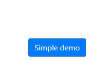
<button type="button" class="btn btn-primary"
        tooltip="Vivamus sagittis lacus vel augue laoreet rutrum faucibus.">
  Simple demo
</button>
import { Component } from '@angular/core';

@Component({
  selector: 'demo-tooltip-basic',
  templateUrl: './basic.html'
})
export class DemoTooltipBasicComponent {}
bsdatepicker
Datepicker is used to add the date picker functionality to your web page. Datepicker is a highly configurable component that is used in your angular project for the selectable date range picker.
The easiest way to add the datepicker component to your app.
ng add ngx-bootstrap --component datepickerUsage
import { BrowserAnimationsModule } from '@angular/platform-browser/animations';

// RECOMMENDED
import { BsDatepickerModule } from 'ngx-bootstrap/datepicker';
// or
import { BsDatepickerModule } from 'ngx-bootstrap';

@NgModule({
  imports: [
    BrowserAnimationsModule,
    BsDatepickerModule.forRoot(),
    ...
  ]
})
export class AppModule(){}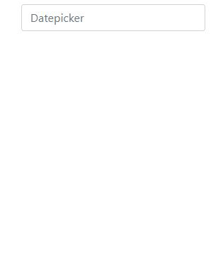
<div class="row">
  <div class="col-xs-12 col-12 col-md-4 form-group">
    <input type="text"
           placeholder="Datepicker"
           class="form-control"
           bsDatepicker>
  </div>
  <div class="col-xs-12 col-12 col-md-4 form-group">
    <input type="text"
           placeholder="Daterangepicker"
           class="form-control"
           bsDaterangepicker>
  </div>
</div>
import { Component } from '@angular/core';
@Component({
selector: 'demo-datepicker-basic',
templateUrl: './basic.html'
})
export class DemoDatepickerBasicComponent {}bsdropdownmodule
Dropdowns are toggleable, contextual overlays for displaying lists of links and more. They’re made interactive with the included dropdown directives.
ng add ngx-bootstrap --component dropdownsUsage
import { BrowserAnimationsModule } from '@angular/platform-browser/animations';

// RECOMMENDED
import { BsDropdownModule } from 'ngx-bootstrap/dropdown';
// or
import { BsDropdownModule } from 'ngx-bootstrap';

@NgModule({
  imports: [
    BrowserAnimationsModule,
    BsDropdownModule.forRoot()
  ]
})
export class AppModule(){}

Also should be added web-animations-js polyfill for IE browser (Edge)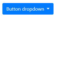
typeaheadoptionfield
The easiest way to add the typeahead component to your app.
ng add ngx-bootstrap --component typeaheadUsage
import { BrowserAnimationsModule } from '@angular/platform-browser/animations';

// RECOMMENDED
import { TypeaheadModule } from 'ngx-bootstrap/typeahead';
// or
import { TypeaheadModule } from 'ngx-bootstrap';

@NgModule({
  imports: [
    BrowserAnimationsModule,
    TypeaheadModule.forRoot(),
    ...
  ]
})
export class AppModule(){}
<pre class="card card-block card-header mb-3">Model: {{selected | json}}</pre>
<input [(ngModel)]="selected"
       [typeahead]="states"
       class="form-control">
import { Component } from '@angular/core';
@Component({
selector: 'demo-typeahead-basic',
templateUrl: './basic.html'
})
export class DemoTypeaheadBasicComponent {
selected: string;
states: string[] = [
'Alabama',
'Alaska',
'Arizona',
'Arkansas',
'California',
'Colorado',
'Connecticut',
'Delaware',
'Florida',
'Georgia',
'Hawaii',
'Idaho',
'Illinois',
'Indiana',
'Iowa',
'Kansas',
'Kentucky',
'Louisiana',
'Maine',
'Maryland',
'Massachusetts',
'Michigan',
'Minnesota',
'Mississippi',
'Missouri',
'Montana',
'Nebraska',
'Nevada',
'New Hampshire',
'New Jersey',
'New Mexico',
'New York',
'North Dakota',
'North Carolina',
'Ohio',
'Oklahoma',
'Oregon',
'Pennsylvania',
'Rhode Island',
'South Carolina',
'South Dakota',
'Tennessee',
'Texas',
'Utah',
'Vermont',
'Virginia',
'Washington',
'West Virginia',
'Wisconsin',
'Wyoming'
];
}Reference
a lot of more ngx components is available on the official site of PrimeNG is valor-software.com You can read more about components on here: Visit
Visit the angular tutorial list. And make strong your angular concept. click here. wuschools.com is always written about the Agular concept for the angular lover. Ang writes about how angular makes your life easy if you are a web site developer.


Great post…
Thank you! Rejesh
Very energetic article, I liked that bit. Will there be a part 2?
Love to spend time near Sea !
Pretty! This was an extremely wonderful article.
Thanks for supplying these details.
Hello there, I believe your blog could possibly be having web browser compatibility problems.
Whenever I look at your site in Safari, it looks fine but
when opening in Internet Explorer, it’s got some overlapping issues.
I just wanted to provide you with a quick heads up!
Other than that, wonderful site!
Wonderful goods from you, man. I have understand your stuff previous to
and you are just too great. I really like what you’ve acquired here, really like what
you are saying and the way in which you say it. You make it enjoyable and you still take
care of to keep it smart. I can’t wait to read far more from you.
This is really a great website.
bookmarked!!, I love your site!
I do trust all the ideas you’ve offered for your post. They’re really
convincing and can certainly work. Still,
the posts are too quick for novices. May you please lengthen them
a bit from next time? Thank you for the post.
The programmer must seek both perfection of part and adequacy of collection. — Alan J. Perlis
That is a good tip particularly to those new to the blogosphere.
Short but very accurate information… Thanks for sharing this one.
A must read post!
Wow, amazing weblog layout! you make blogging look easy. The total glance of your web site is wonderful, let
alone the content!
Great web site. Plenty of useful info here. I am sending it to a few friends ans additionally sharing in delicious.
And naturally, thanks on your effort!
Excellent blog here! Also your web site loads up fast!
What web host are you using? Can I get your affiliate link to your
host? I wish my web site loaded up as fast as yours lol
Good article. I will be dealing with many of these issues as
well..
I every time spent my half an hour to read this website’s content every
day along with a cup of coffee.
Wonderful work! This is the kind of information that are supposed to be shared around the web.
Come on over and talk over with my web site .
Thank you =)
It’s going to be finish of mine day, but before ending I am reading this enormous post to increase my knowledge.
Great work! This is the type of info that should be
shared around the net. Disgrace on Google for now not positioning this submit higher!
Come on over and seek advice from my website .
Thank you =)