We all know that sites with product offers or services are visually different from online magazines. This isn’t surprising. Other activity types should have the functionality to ensure smooth operation and look convenient and attractive to visitors. A separate design proposal for such websites is a news portal HTML template. These developments readers can find on the cool marketplace TemplateMonster.
Today we propose considering the main visual and design differences between an online website with articles and an online store. Having realized all the necessary points, you’ll be able to choose the right theme in the future to create a new look.
What Is News Portal HTML Template
After looking at the offers on TemplateMonster, we understood that they are all segmented. The marketplace offers various offers for Magento, Shopify, WordPress, PrestaShop, and Joomla. Separately rendered themes for HyperText Markup Language. In the first case, you can only use services for Magento, for example. The difference between the news portal HTML template is that the development is fully editable with any available code editor or website builder.
Therefore, it is conditionally suitable for everyone. Very convenient, no need to look for special developments.
After installing the development and making the necessary settings, you see the result immediately. It doesn’t take much time for this. And yes, little knowledge is required. All products come with cool, extended, and simple instructions.
Difference Number 1 – Color Scheme
You can even build your brand or online publishing house. However, it would help if you didn’t use such a variety and variegation as in shops.
The ideal would be an option of 3-4 colors. This point includes the background color.
Such shades are most popular in modern magazines:
- White or light gray is the main one.
- Black for frames and lines.
- One of the brightest options to place accents, highlight the main article of the day, or attract attention.
- Therefore, when choosing a new appearance, pay attention to the developers’ combinations. Often, the purchase includes several color schemes at once. Some developers apply to each one and view them in the Demo.
Difference Number 2 – Required Components
If the critical moments for the shop are an order form, a wishlist, or a quick view of the goods, then there are completely different things in your case.
The required components include the following:
- Subscription. It’s important to make mailings because they increase the resource’s popularity and promote the publication’s brand.
- Links to social networks. Now, this tool is used more actively than ever. After all, people read a message on Facebook or Twitter faster than they will look for a specialized website. Grow the audience of your official groups and the public.
- Article of the day. A separate component where the visitor can quickly and fluently get acquainted with key events in the world or country.
- Contact page. Suppose readers see the office address or location on the map and trust in such a resource increases.
A drop-down menu will probably be essential for any website. It gives a more modern look and inspires confidence because it’s clear that the owner is working on appearance and trying to maintain his image.
Difference Number 3 – Page Structure
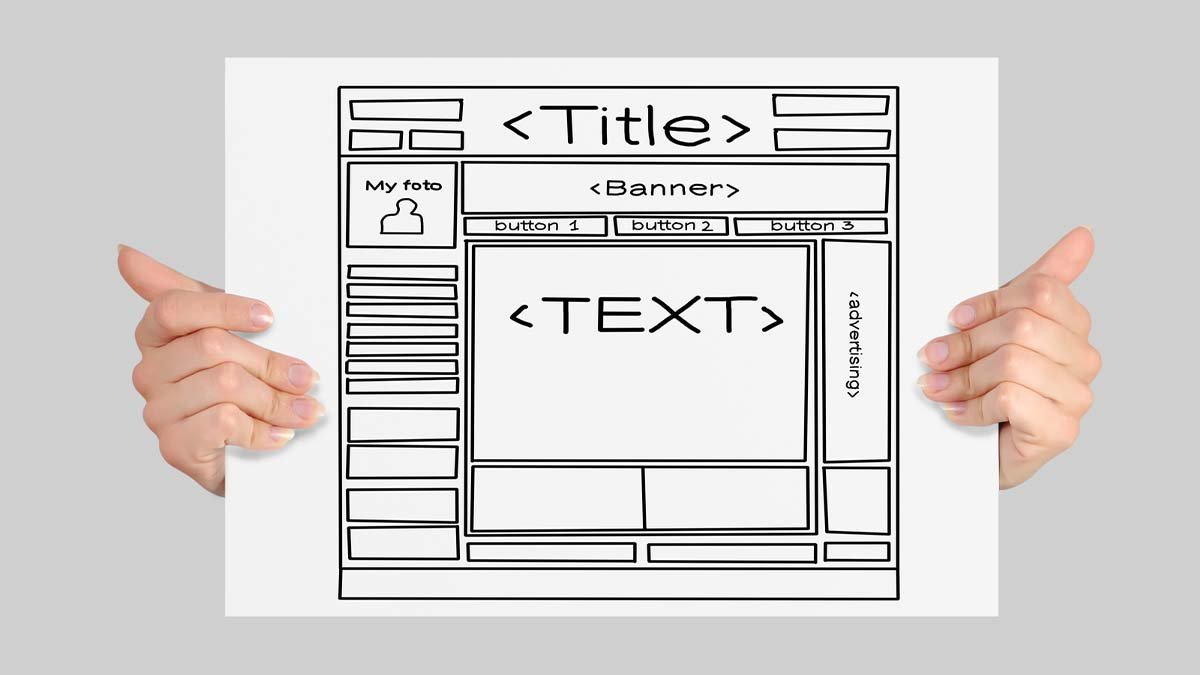
You have probably already noticed that the product filter is usually located on the left or at the top. Online publications typically have a different design. Going to the main page, you see the key headings, and this central place is immediately visible. All other elements are just additions to it. The main zone is often in the middle or on the left.
Of course, this point may cause a lot of controversies. The main thing is that the layouts look logical. The first line should be visible and conspicuous.
Pay attention to this point when discovering the Demo. Also, don’t forget to see how the mockups look on mobile devices and smartphones. TemplateMonster gives such an opportunity. The mobile device preview buttons are at the Demo page’s top.
FAQ
- What is the news portal HTML template?
The development offers ready-made designs for all pages, which buyers may edit. Usually, it has many settings options and is easy to use. - How to find a news portal HTML template?
You may find many sources offering to download or buy a theme. However, it would help if you trusted proven marketplaces with a good reputation. TemplateMonster is one of those websites that have been on the market for a long time. - How to edit the news portal HTML template?
It’s possible, and sometimes even necessary, to make some adjustments to the layouts. So that buyers can easily change the pages, the developers wrote instructions. It’s large, informative, and answers all the important points in the work. - Does the news portal HTML template have support?
Note that paid offers differ in that they usually have constant updates so that the layouts work correctly. The developers also provide a support service to all customers.


