
Learn how to create the custom checkbox CSS by using HTML and CSS. In this post, I have provided you different Checkbox CSS examples with code. You are bored by using the simple checkbox CSS in your HTML website, from this post you can get different styles of checkbox CSS. You can copy this code and add it to your projects. There are different checkbox CSS examples. That really helps you to design your checkbox CSS.
Checkbox CSS Example
Checkbox CSS Example #1
Step1: Add HTML code (checkbox css)
<!DOCTYPE html>
<html>
<head>
<title>Checkboxes CSS</title>
</head>
<body>

<h1>Custom Checkboxes</h1>
<label class="container">One
  <input type="checkbox" checked="checked">
  <span class="checkmark"></span>
</label>
<label class="container">Two
  <input type="checkbox">
  <span class="checkmark"></span>
</label>
<label class="container">Three
  <input type="checkbox">
  <span class="checkmark"></span>
</label>
<label class="container">Four
  <input type="checkbox">
  <span class="checkmark"></span>
</label>

</body>
</html>
Step2: CSS file code (checkbox css)
/* The container */
.container {
  display: block;
  position: relative;
  padding-left: 35px;
  margin-bottom: 12px;
  cursor: pointer;
  font-size: 22px;
  -webkit-user-select: none;
  -moz-user-select: none;
  -ms-user-select: none;
  user-select: none;
}

/* Hide the browser's default checkbox */
.container input {
  position: absolute;
  opacity: 0;
  cursor: pointer;
  height: 0;
  width: 0;
}

/* Create a custom checkbox */
.checkmark {
  position: absolute;
  top: 0;
  left: 0;
  height: 25px;
  width: 25px;
  background-color: #eee;
}

/* On mouse-over, add a grey background color */
.container:hover input ~ .checkmark {
  background-color: #ccc;
}

/* When the checkbox is checked, add a blue background */
.container input:checked ~ .checkmark {
  background-color: #2196F3;
}

/* Create the checkmark/indicator (hidden when not checked) */
.checkmark:after {
  content: "";
  position: absolute;
  display: none;
}

/* Show the checkmark when checked */
.container input:checked ~ .checkmark:after {
  display: block;
}

/* Style the checkmark/indicator */
.container .checkmark:after {
  left: 9px;
  top: 5px;
  width: 5px;
  height: 10px;
  border: solid white;
  border-width: 0 3px 3px 0;
  -webkit-transform: rotate(45deg);
  -ms-transform: rotate(45deg);
  transform: rotate(45deg);
}
OUTPUT

Checkbox CSS Example #2
Step1: Add HTML (checkbox css)
<input type="checkbox" id="todo" name="todo" value="todo">
<label for="todo" data-content="Get out of bed">Get out of bed</label>
Step2: Add CSS (checkbox css)
@import url('https://fonts.googleapis.com/css?family=Source+Sans+Pro:600&display=swap');

$black: #363839;
$lightgray: #9c9e9f;
$gray: #bdc1c6;
$white: #fff;
$green: #06842c;

* {
  box-sizing: border-box;
  &::before, &::after {
    box-sizing: border-box;
  }
}

body {
  font-family: 'Source Sans Pro', sans-serif;
  display: flex;
  align-items: center;
  justify-content: center;
  margin: 0;
  min-height: 100vh;
}

input[type="checkbox"] {
  position: relative;
  width: 1.5em;
  height: 1.5em;
  color: $black;
  border: 1px solid $gray;
  border-radius: 4px;
  appearance: none;
  outline: 0;
  cursor: pointer;
  transition: background 175ms cubic-bezier(0.1, 0.1, 0.25, 1);
  &::before {
    position: absolute;
    content: '';
    display: block;
    top: 2px;
    left: 7px;
    width: 8px;
    height: 14px;
    border-style: solid;
    border-color: $white;
    border-width: 0 2px 2px 0;
    transform: rotate(45deg);
    opacity: 0;
  }
  &:checked {
    color: $white;
    border-color: $green;
    background: $green;
    &::before {
      opacity: 1;
    }
    ~ label::before {
      clip-path: polygon(0 0, 100% 0, 100% 100%, 0 100%);
    }
  }
}

label {
  position: relative;
  cursor: pointer;
  font-size: 1.5em;
  font-weight: 600;
  padding: 0 0.25em 0;
  user-select: none;
  &::before {
    position: absolute;
    content: attr(data-content);
    color: $lightgray;
    clip-path: polygon(0 0, 0 0, 0% 100%, 0 100%);
    text-decoration: line-through;
    text-decoration-thickness: 3px;
    text-decoration-color: $black;
    transition: clip-path 200ms cubic-bezier(0.25, 0.46, 0.45, 0.94);
  }
}
OUTPUT

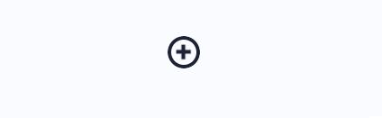
Checkbox CSS Example #3
Step1: Add HTML (checkbox css)
<input type="checkbox" class="plus-minus">

<!-- dribbble - twitter -->
<a class="dribbble" href="https://dribbble.com/shots/9834681--Toggle" target="_blank"><img src="https://cdn.dribbble.com/assets/dribbble-ball-mark-2bd45f09c2fb58dbbfb44766d5d1d07c5a12972d602ef8b32204d28fa3dda554.svg" alt=""></a>
<a class="twitter" target="_blank" href="https://twitter.com/aaroniker_me"><svg xmlns="http://www.w3.org/2000/svg" width="72" height="72" viewBox="0 0 72 72"><path d="M67.812 16.141a26.246 26.246 0 0 1-7.519 2.06 13.134 13.134 0 0 0 5.756-7.244 26.127 26.127 0 0 1-8.313 3.176A13.075 13.075 0 0 0 48.182 10c-7.229 0-13.092 5.861-13.092 13.093 0 1.026.118 2.021.338 2.981-10.885-.548-20.528-5.757-26.987-13.679a13.048 13.048 0 0 0-1.771 6.581c0 4.542 2.312 8.551 5.824 10.898a13.048 13.048 0 0 1-5.93-1.638c-.002.055-.002.11-.002.162 0 6.345 4.513 11.638 10.504 12.84a13.177 13.177 0 0 1-3.449.457c-.846 0-1.667-.078-2.465-.231 1.667 5.2 6.499 8.986 12.23 9.09a26.276 26.276 0 0 1-16.26 5.606A26.21 26.21 0 0 1 4 55.976a37.036 37.036 0 0 0 20.067 5.882c24.083 0 37.251-19.949 37.251-37.249 0-.566-.014-1.134-.039-1.694a26.597 26.597 0 0 0 6.533-6.774z"></path></svg></a>Step2: Add CSS (checkbox css)
.plus-minus {
    --primary: #1E2235;
    --secondary: #FAFBFF;
    --duration: .5s;
    -webkit-appearance: none;
    -moz-appearance: none;
    -webkit-tap-highlight-color: transparent;
    -webkit-mask-image: -webkit-radial-gradient(white, black);
    outline: none;
    cursor: pointer;
    position: relative;
    overflow: hidden;
    transform-style: preserve-3d;
    perspective: 240px;
    border-radius: 50%;
    width: 36px;
    height: 36px;
    border: 4px solid var(--primary);
    background-size: 300% 300%;
    transition: transform .3s;
    transform: scale(var(--scale, 1)) translateZ(0);
    animation: var(--name, unchecked) var(--duration) ease forwards;
    &:before,
    &:after {
        content: '';
        position: absolute;
        width: 16px;
        height: var(--height, 16px);
        left: 6px;
        top: var(--top, 6px);
        background: var(--background, var(--primary));
        animation: var(--name-icon-b, var(--name-icon, unchecked-icon)) var(--duration) ease forwards;
    }
    &:before {
        clip-path: polygon(0 6px, 6px 6px, 6px 0, 10px 0, 10px 6px, 16px 6px, 16px 10px, 10px 10px, 10px 16px, 6px 16px, 6px 10px, 0 10px);
    }
    &:after {
        --height: 4px;
        --top: 12px;
        --background: var(--secondary);
        --name-icon-b: var(--name-icon-a, checked-icon);
    }
    &:active {
        --scale: .95;
    }
    &:checked {
        --name: checked;
        --name-icon-b: checked-icon;
        --name-icon-a: unchecked-icon;
    }
}

@keyframes checked-icon {
    from {
        transform: translateZ(12px);
    }
    to {
        transform: translateX(16px) rotateY(90deg) translateZ(12px);
    }
}

@keyframes unchecked-icon {
    from {
        transform: translateX(-16px) rotateY(-90deg) translateZ(12px);
    }
    to {
        transform: translateZ(12px);
    }
}

@keyframes checked {
    from {
        background-image: radial-gradient(ellipse at center, var(--primary) 0%, var(--primary) 25%, var(--secondary) 25.1%, var(--secondary) 100%);
        background-position: 100% 50%;
    }
    to {
        background-image: radial-gradient(ellipse at center, var(--primary) 0%, var(--primary) 25%, var(--secondary) 25.1%, var(--secondary) 100%);
        background-position: 50% 50%;
    }
}

@keyframes unchecked {
    from {
        background-image: radial-gradient(ellipse at center, var(--secondary) 0%, var(--secondary) 25%, var(--primary) 25.1%, var(--primary) 100%);
        background-position: 100% 50%;
    }
    to {
        background-image: radial-gradient(ellipse at center, var(--secondary) 0%, var(--secondary) 25%, var(--primary) 25.1%, var(--primary) 100%);
        background-position: 50% 50%;
    }
}

html {
    box-sizing: border-box;
    -webkit-font-smoothing: antialiased;
}

* {
    box-sizing: inherit;
    &:before,
    &:after {
        box-sizing: inherit;
    }
}

// Center & dribbble
body {
    min-height: 100vh;
    display: flex;
    font-family: 'Roboto', Arial;
    justify-content: center;
    align-items: center;
    flex-direction: column;
    background: #FAFBFF;
    .dribbble {
        position: fixed;
        display: block;
        right: 20px;
        bottom: 20px;
        img {
            display: block;
            height: 28px;
        }
    }
    .twitter {
        position: fixed;
        display: block;
        right: 64px;
        bottom: 14px;
        svg {
            width: 32px;
            height: 32px;
            fill: #1da1f2;
        }
    }
}
OUTPUT
Checkbox CSS Example #4
Step1: Add HTML
.cbx
  input#cbx(type='checkbox')
  label(for='cbx')
  svg(width='15' height='14' viewbox='0 0 15 14' fill='none')
    path(d='M2 8.36364L6.23077 12L13 2')
// Gooey
svg(xmlns='http://www.w3.org/2000/svg' version='1.1')
  defs
    filter#goo
      fegaussianblur(in='SourceGraphic' stddeviation='4' result='blur')
      fecolormatrix(in='blur' mode='matrix' values='1 0 0 0 0  0 1 0 0 0  0 0 1 0 0  0 0 0 22 -7' result='goo')
      feblend(in='SourceGraphic' in2='goo')
Step2: Add CSS
$primary = #866efb

*
  box-sizing: border-box

input[type="checkbox"]
  -webkit-appearance: none
  -moz-appearance: none
  appearance: none
  -webkit-tap-highlight-color: transparent
  cursor: pointer
  margin: 0
  &:focus
    outline: 0

.cbx
  position: absolute
  width: 24px
  height: 24px
  //transform: scale(3)
  top: calc(50vh - 12px)
  left: calc(50vw - 12px)

  input
    position: absolute
    top: 0
    left: 0
    width: 24px
    height: 24px
    border: 2px solid #bfbfc0
    border-radius: 50%

  label
    width: 24px
    height: 24px
    background: none
    border-radius: 50%
    position: absolute
    top: 0
    left: 0
    -webkit-filter: url(#goo)
    filter: url(#goo)
    transform: trasnlate3d(0,0,0)
    pointer-events: none

  svg
    position: absolute
    top: 5px
    left: 4px
    z-index: 1
    pointer-events: none
    path
      stroke: white
      stroke-width: 3
      stroke-linecap: round
      stroke-linejoin: round
      stroke-dasharray: 19
      stroke-dashoffset: 19
      transition: stroke-dashoffset .3s ease
      transition-delay: .2s

  input:checked
    + label
      animation: splash .6s ease forwards
      + svg path
        stroke-dashoffset: 0

@keyframes splash
  40%
    background: $primary
    box-shadow: 0 -18px 0 -8px $primary, 16px -8px 0 -8px $primary, 16px 8px 0 -8px $primary, 0 18px 0 -8px $primary, -16px 8px 0 -8px $primary, -16px -8px 0 -8px $primary
  100%
    background: $primary
    box-shadow: 0 -36px 0 -10px transparent, 32px -16px 0 -10px transparent, 32px 16px 0 -10px transparent, 0 36px 0 -10px transparent, -32px 16px 0 -10px transparent, -32px -16px 0 -10px transparent
OUTPUT

Checkbox CSS Example #5
Step1: Add HTML
<input type="checkbox" id="_checkbox">
<label for="_checkbox">
  <div id="tick_mark"></div>
</label>Step2: Add CSS
*
{
    -webkit-tap-highlight-color: transparent;
    outline: none;
}

html, body
{
    height: 100%;
}

body
{
    margin: 0;
}

#_checkbox
{
    display: none;
}

label
{
    position: absolute;
    top: 50%;
    right: 0;
    left: 0;
    width: 100px;
    height: 100px;
    margin: 0 auto;
    background-color: #f72414;
    transform: translateY(-50%);
    border-radius: 50%;
    box-shadow: 0 7px 10px #ffbeb8;
    cursor: pointer;
    transition: 0.2s ease transform, 0.2s ease background-color, 0.2s ease box-shadow;
    overflow: hidden;
    z-index: 1;
}

label:before
{
    content: "";
    position: absolute;
    top: 50%;
    right: 0;
    left: 0;
    width: 70px;
    height: 70px;
    margin: 0 auto;
    background-color: #fff;
    transform: translateY(-50%);
    border-radius: 50%;
    box-shadow: inset 0 7px 10px #ffbeb8;
    transition: 0.2s ease width, 0.2s ease height;
}

label:hover:before
{
    width: 55px;
    height: 55px;
    box-shadow: inset 0 7px 10px #ff9d96;
}

label:active
{
    transform: translateY(-50%) scale(0.9);
}

#tick_mark
{
    position: absolute;
    top: -1px;
    right: 0;
    left: 0;
    width: 60px;
    height: 60px;
    margin: 0 auto;
    margin-left: 14px;
    transform: rotateZ(-40deg);
}

#tick_mark:before, #tick_mark:after
{
    content: "";
    position: absolute;
    background-color: #fff;
    border-radius: 2px;
    opacity: 0;
    transition: 0.2s ease transform, 0.2s ease opacity;
}

#tick_mark:before
{
    left: 0;
    bottom: 0;
    width: 10px;
    height: 30px;
    box-shadow: -2px 0 5px rgba(0,0,0,0.23);
    transform: translateY(-68px)
}

#tick_mark:after
{
    left: 0;
    bottom: 0;
    width: 100%;
    height: 10px;
    box-shadow: 0 3px 5px rgba(0,0,0,0.23);
    transform: translateX(78px)
}

#_checkbox:checked + label
{
    background-color: #07d410;
    box-shadow: 0 7px 10px #92ff97;
}

#_checkbox:checked + label:before
{
    width: 0;
    height: 0;
}

#_checkbox:checked + label #tick_mark:before, #_checkbox:checked + label #tick_mark:after
{
    transform: translate(0);
    opacity: 1;
}
OUTPUT

If you want to learn more about CSS visit the official website: Visit
Visit the CSS tutorial list. And make strong your CSS concept. Click here. wuschools.com is always written about the CSS concept for the CSS lover. Ang writes about how CSS makes your life easy if you are a web site developer. We help you to continue your learning.


