Bootstrap is among the most widely used front-end frameworks that can be used to create mobile-friendly, responsive websites. It doesn’t matter if you’re a new developer, or trying to create a simple website in a short time, Bootstrap helps you design stunning layouts without having to write CSS completely from scratch. This step-by-step guide will take you through the fundamentals in a straightforward, easy and practical manner.
1. What Is Bootstrap?

Bootstrap is a pre-designed collection comprising CSS as well as JavaScript components that help make website development more efficient and less time-consuming. It comes with pre-styled elements like buttons, forms grids, cards alerts, navbars and Modals. With Bootstrap even novices can design professional-looking websites.
2. Why Use Bootstrap?

The Bootstrap brand is popular due to the fact that it:
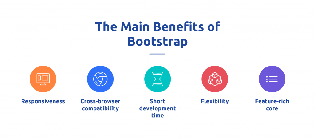
- Mobile-first responsive design
- Consistent and clean UI
- Pre-built components
- Easy to customize
- Fast development
- Cross-browser compatibility
This makes it ideal for corporate websites and landing pages, administrative dashboards portfolios, portfolios, and other E-commerce interfaces.
3. How to Start Using Bootstrap
You can utilize Bootstrap in two ways:
Method 1: Using CDN (Quick & Easiest)
Simply add Bootstrap’s CSS and CDN links from JS inside the HTML document.
( The links are not shown in the actual format use the same structure with no URLs.)
4. Understanding the Bootstrap Grid System (Concept Only)
This grid divides the web page into twelve columns. The columns can be combined to create sections of any size. The grid adjusts automatically based on the device.
- On mobiles, columns could be stacked vertically to make reading easier.
- On desktops or tablets, columns can be arranged horizontally, in a row.
- On screens with large screen sizes elements grow to make more room.
The flexibility of this layout is what makes Bootstrap perfect for responsive websites.
5. Bootstrap Breakpoints Explained
Breakpoints control the layout that works best with different sizes of screens. Screen sizes that are the most important include:
- Extra-small perfect for mobile screens
- Small – slightly bigger mobile devices
- Medium – tablets
- Large – laptops
- Extra large – desktops
- Extra extra large – wide screens
Breakpoints can be used to determine when objects expand, shrink, or move.
6. Components You Build Using Bootstrap (No Code required)
Bootstrap provides a variety of UI elements that look contemporary and fresh straight out of the box. Below is an explanation of the concept of the most popular elements:
1. Buttons
Bootstrap has buttons that come in a variety of styles like primary and success warning, dark outline, light and more.
2. Navigation Bars
The navbar component lets you to build dynamic menus that fold into a toggle on tiny screens.
3. Cards
Cards are boxes that can be designed to accommodate content blocks such as previews of products, blog posts testimonials, service sections or feature descriptions.
4. Alerts
Alerts are important reminders of messages, such as warnings or errors, notifications or prompts for success.
5. Forms
Forms within Bootstrap are clean and professional with little effort. The input fields are smooth and easy to use labeled fields, checkboxes and labels switches, and much more.
6. Modals
Modals are pop-up windows that are that are used to display messages such as confirmations, forms or login windows.
7. Carousels
Carousels rotate slides of content or images by hand or automatically. Ideal for banners on homepages.
7. Bootstrap Utility Classes (Concept Only)
Utility classes help you quickly manage:
- Margins and padding
- The alignment and colors of the text
- Background color
- Element sizing
- Flexbox alignment
- Display behavior (show/hide elements)
- Shadows and border radius
These classes allow you to tweak your design visually, without having to write your own CSS.
8. How Bootstrap Helps With Responsive Design
Responsive design is a way to ensure that your website will look nice across all devices. Bootstrap helps ensure this through:
- Automatically altering layouts using its grid
- Modifying column behavior in response to breakpoints
- Expanding or shrinking elements based on the screen’s size
- You can hide or show certain elements on certain devices.
- Making sure that spacing and typography are visible across all screens
It’s not necessary to have sophisticated CSS skills Bootstrap does the majority of the heavy lifting for you.
9. Best Practices for Learning Bootstrap
Use these suggestions to achieve the most effective results as beginning to learn:
- Begin with pages that are simple, such as an area for content, a header and footer.
- Know the grid system well as it’s the foundation concept behind layouts.
- Utilize utility classes instead of creating custom CSS whenever you can.
- Make sure your design is simple and clear Bootstrap is the very effective in this manner.
- Learn about components slowly instead of trying to master all of it.
- Learn by re-creating websites that you are familiar with by using Bootstrap concepts.
10. The Things You can Build With Bootstrap for Beginners
Once you’ve mastered the fundamentals once you know the basics, you can create:
- Complete landing pages
- Service sites
- Portfolio pages
- Blog layouts
- Sections of product showcases
- Pricing tables
- Admin dashboards
- Contact pages
- Multi-section websites for business
Bootstrap’s ready-made design language helps beginners achieve expert-level design quality.
11. When Should You Use Bootstrap?
Bootstrap is most effective if you need to:
- Build websites quickly
- Make sure that your layouts are consistent and neat.
- Do not write complex CSS
- Design a responsive interface with minimal effort
- Make use of components such as navbars alerts, cards or Modals
- Design professional layouts even with only a little knowledge of design
It’s ideal for students, freelancers agencies, bloggers and even small-sized businesses.
12. Advantages and Limitations of Bootstrap
Advantages
- Fast development
- Consistent design structure
- Excellent documentation
- Easy to learn curve
- There is no need to design elements manually
- Mobile-friendly and accessible
Limitations
- Sites can look the same even if they are not custom-designed
- The stress of class can be a burden
- Not ideal for extremely unique designs
However, for those who are just beginning, Bootstrap is one of the most effective tools for learning the latest web design.
13. Final Thoughts
Bootstrap remains among the most user-friendly tools for creating modern dynamic, responsive, and visually uniform websites. It eliminates the hassle creating CSS manually and provides you with a the most simple design framework to use. If you’re creating your own personal site, corporate page, or just developing front-end applications, Bootstrap is a perfect base to begin.


